Full service design for a digital safety startup
78%
Reduction in bounce on the homepage.
40%
Reduction in onboarding churn.
1m to over 6m
the number of kids covered from when I started to when I left.
I started as employee 18 of Bark and left when they had over 120. I worked my way up to the senior most creative in the company and managed a design team of 3. I ushered in a brand refresh, a social media program, multiple full website builds, physical products, and UI/UX overhauls of the app itself.
Jargon incoming - I worked directly with growth marketers and devs to streamline the customer funnel and onboarding flow through extensive testing. I’m not just making pretty pictures over here, I know what KPI stands for.

My team and I worked with marketers to create dozens of homepage variations to cater to different types of incoming traffic. Once we would find a winner, we then moved to rapid A/B testing to optimize the patterns on the page. Then we did that for over a dozen other pages.

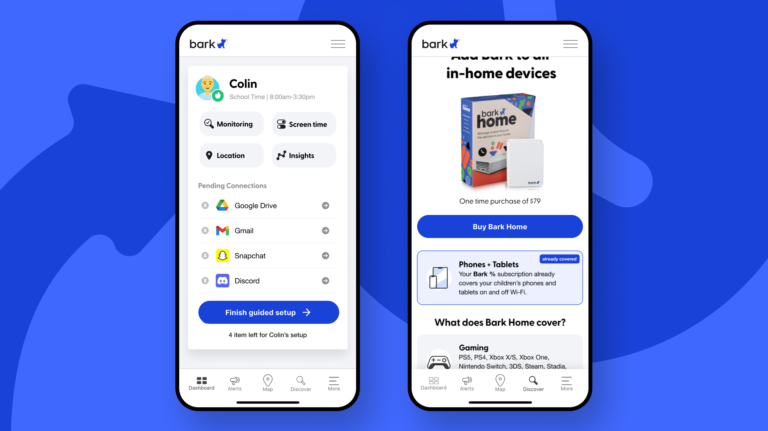
Here's some examples of in-app components that I designed. That Bark home upsell pattern created help boost sales of the Bark Home by 3%.

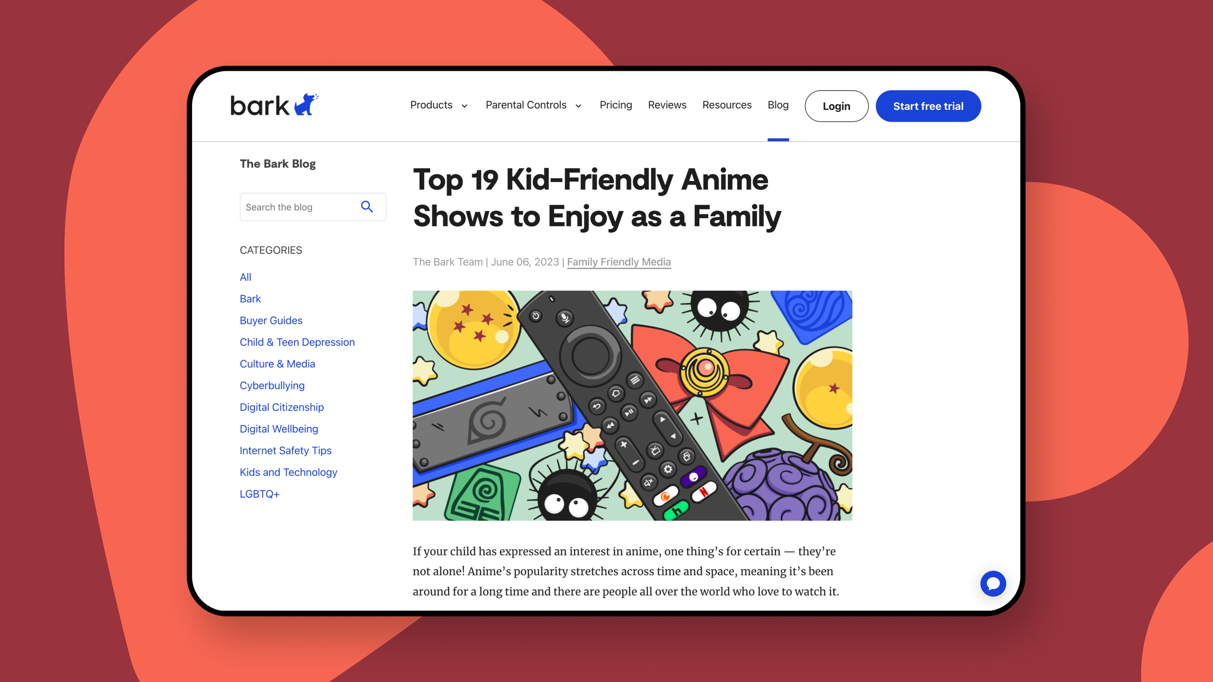
I was also in charge of creating a new blog site from the ground up. I worked with contract devs to not only code the project but to also scrape all old blog posts from bark and automatically populate them into the new formatting.

One of my other priorities was to design the flow and visuals for new announcements in the app.
Brand guidelines + illustration suite
I was solely in charge of a major brand refresh to help launch a huge increase in media and product budget. We’re talking everything from social to display ads, packaging, and content rules for images and tone.

Colors, Typography, logo usage, how to make spot illos, etc.. classic guidelines stuff.

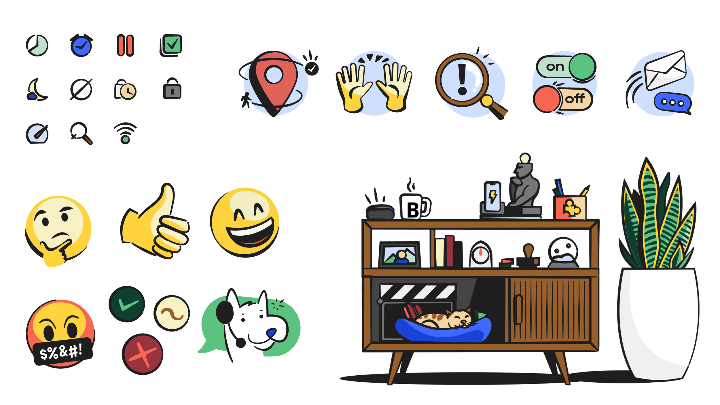
Here's an example of the new illustration standards. I created rules, examples, and custom assets to assist in making the new style achievable to the other internal designers.

A big part of the new brand push was to have collages of parents/caretakers and kids interacting with abstractions of the app. These really helped break up the shear amount phone mockups of the app.

Example of an inline ad on a content page.

For social content and blog imagery, we decided to take a more editorial angle with more variety as opposed to the tight rules for the onsite and app visual content. We still wanted these illustrations to feel like part of the brand so color guides are still followed.

In classic fashion, we had to start launching a product (Bark home) before the brand refresh was ready. Luckily, we were still able to inject some of the design intent of the refresh into the packaging.


